
Custom theming
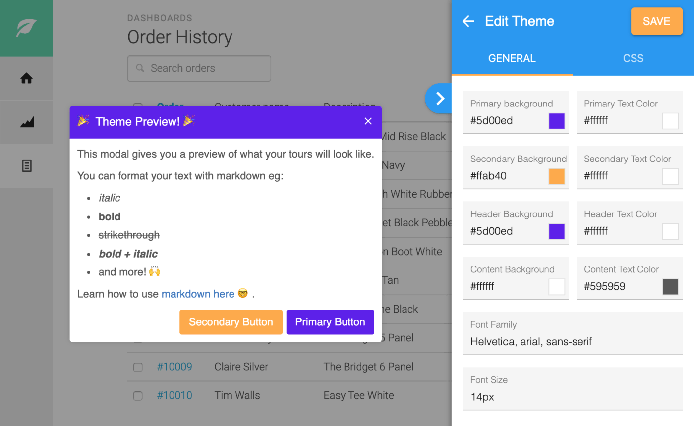
You can customize the fonts, colors, backgrounds of your tours from the HelpHero Editor. The customizations you make will apply across all tours you create. The HelpHero Editor will show you a preview of your customizations live as you make changes. This makes effortless to get the look and feel of your tours just right.
Getting to your theme editor
Section titled “Getting to your theme editor”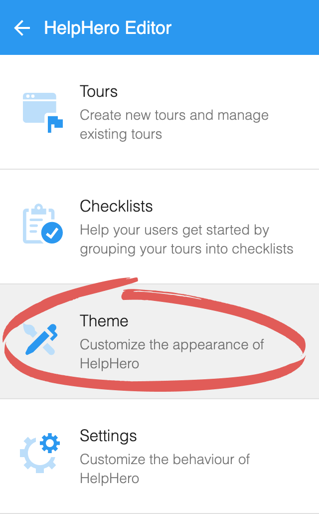
Editing your theme
Section titled “Editing your theme”You can edit the basic styling of the HelpHero UI components. Changes you make will apply across all of your tours.
Custom CSS
Section titled “Custom CSS”For more advanced styling customizations to the the HelpHero UI you can specify custom CSS.
2.1 Change to the CSS tab
Section titled “2.1 Change to the CSS tab”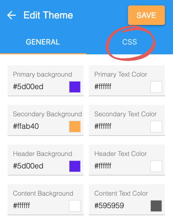
2.2 Add a CSS declaration
Section titled “2.2 Add a CSS declaration”To give you an idea of what you can achieve with custom CSS, heres an example we prepared earlier. Copy and paste this into the Custom CSS field.
.hlp-dialog-header,.hlp-dialog-footer {  font-family: "Open Sans", sans-serif !important;  font-weight: 800 !important;  text-transform: uppercase !important;}
.hlp-dialog-footer button {  text-transform: uppercase !important;  border-radius: 2px !important;  background: black !important;}
.hlp-dialog-footer {  padding-bottom: 20px !important;}
.hlp-dialog-body {  padding: 40px 20px !important;}
.hlp-dialog-header {  font-size: 25px !important;  padding: 40px 40px !important;  height: 230px !important;  background-size: 550px 300px;  display: flex;  align-items: center;  justify-content: center;}
.hlp-dialog-body {  font-size: 1.1em !important;  padding: 20px 40px !important;}
.hlp-dialog-footer,.hlp-dialog-header {  text-align: center !important;}
.hlp-dialog-header button {  height: auto !important;}
.hlp-dialog-footer button {  font-size: 1.1em !important;  padding: 8px 30px !important;}
.hlp-dialog-header .hlp-content {  padding-right: 0 !important;}
.hlp-dialog-header {  background-color: black !important;  background-image: url(https://sandbox.helphero.co/images/examples/theme.jpg) !important;}