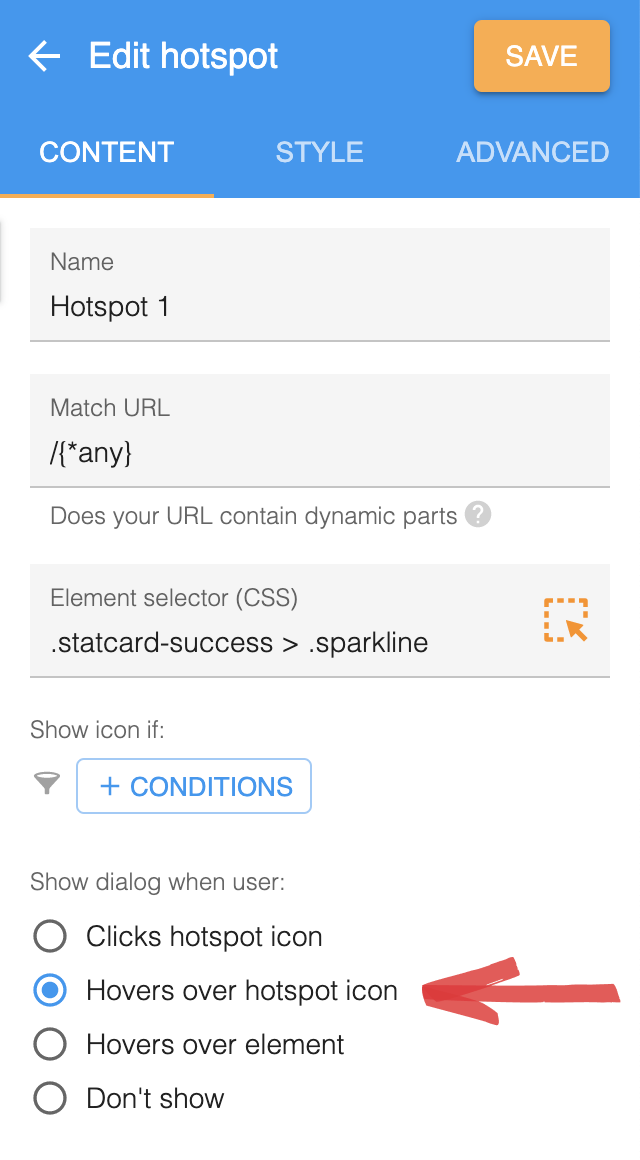
Showing hotspots on hover
Setting up a hotspot to show on hover is a great way to offer quick and simple guidance to point your users in the right direction. Hotspots setup like this act in a similar fashion to traditional tooltips.
Click action
You can specify an action to occur when the user clicks on the hotspot icon. Starting a tour when the user clicks on the hotspot can be a great way to give the user further information and guidance on the particular feature you are showcasing. When doing this we recommend adding a call to action in the hotspot dialog ie 👈 click me to learn more
Interactive content
Since the hotspot dialog is shown on hover we recommend avoiding content that requires user interaction such as videos or buttons. The hotspot dialog will be hidden as soon as the users moves their mouse away. For this reason the user won’t have the chance to interact with the hotspot dialog. If you would like present the user with more options we recommend having a start tour click action and present them with those options in the first step of the tour.
No icon
In some cases you may want to hide the hotspot icon for example if you have chosen to show the hotspot dialog on element hover rather than icon hover. If you would like to hide the icon you can set the icon size to zero in the style panel of the hotspot editor.