Targeting media queries
If your web app is responsive you may want to setup different tours for different screen sizes.
1. Track media query result
Section titled “1. Track media query result”Pass appropriate media query results as user properties to HelpHero.
<script>  // update as appropriate to your CSS  var mediaQuery = window.matchMedia && window.matchMedia('(max-width: 767px)')
  HelpHero.identify('<?php echo get_current_user_id(); ?>', {    isMobile: mediaQuery != null && mediaQuery.matches  });
// Optional respond to browser resizes if (mediaQuery != null) { mediaQuery.addListener(function (ev) { HelpHero.update({ isMobile: ev.matches }); }); }</script>2. Setup a funnel
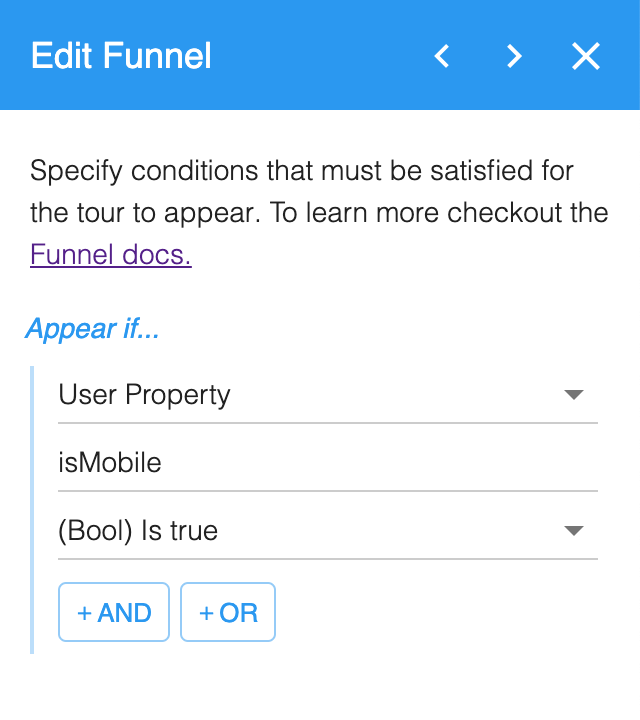
Section titled “2. Setup a funnel”Now that you are tracking this as a user property you can setup a tour to only show if the user is on a mobile screen size. In the HelpHero Editor edit your tour and add a new funnel step after the first URL Match.