Onboarding tooltips give users
answers when they need them
- Help that waits to be askedA tour starts itself and takes over the screen. A hotspot just sits there next to the control, and nothing happens until a user reaches for it.Orders +21%
- One control, not a whole flowA tour walks a user through a sequence of steps. A hotspot explains the single thing they're looking at right now.
- Announce something new where it livesPut one on the feature you just shipped so users meet it in the product, rather than in an email they were never going to open.YearlyMonthly
Hover or click, and why the choice
matters more than it sounds
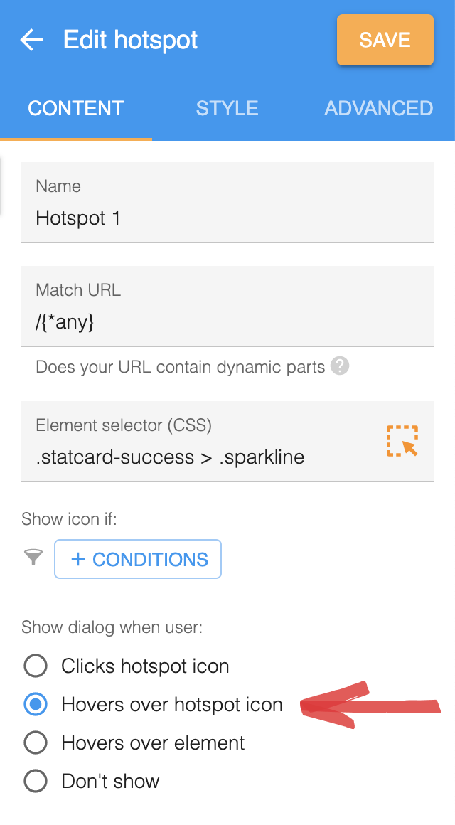
- Hover suits a one-line answerThe dialog appears while a user rests the pointer on the icon, then hides again the moment they move away. That's room enough for a short line of explanation.
- Click when the dialog does more than talkHere the dialog stays open until they click away, so buttons and video work properly. On hover they'd never get the chance to reach them.
- It can hand off to a tourClicking the icon can start a full tour, which pairs nicely with a hover dialog that says click me to learn more. That's the answer when one line was never going to cover it.
Show it once, then get out of the way
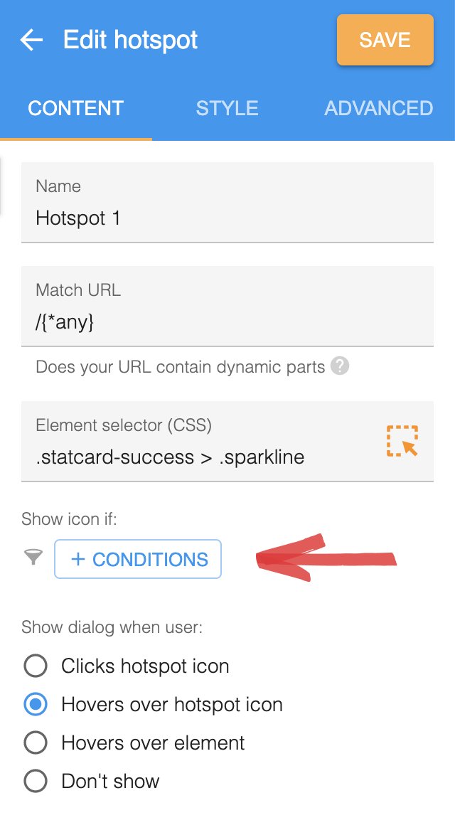
- By default it shows every timeWorth knowing before you ship one, because a hotspot with no condition on it keeps reappearing for users who read it weeks ago.
- Show only if not already openedOne condition turns it into a one-time thing, counted from the moment a user opens the dialog on either hover or click.
- Dismissing it is permanentAdd a dismiss button, and any hotspot a user closes never comes back. That part is automatic, with no condition for you to write.
Common questions about onboarding tooltips
What is an onboarding tooltip?
An onboarding tooltip is a short explanation attached to one control in your app, shown when a user hovers over it or clicks it rather than sitting on the page all the time. It answers a question at the point the question comes up, which is what separates it from a tour that runs as a sequence from the beginning.
What are the different types of tooltips?
Tooltips sort into two groups, by trigger and by job. By trigger, one can open when a user hovers the icon, hovers the element itself, or clicks the icon. That choice matters more than it looks, because a dialog shown on hover vanishes as soon as the mouse moves, so anything with a button or a video in it only works on click. By job, a tooltip either explains a control in a line, announces something new where that thing lives, or hands off to a full tour when a line isn't enough.
What is the difference between a hotspot and a tooltip?
They're two names for one thing. A hotspot is the beacon that sits on an element, and the tooltip is the dialog it reveals on hover or click. HelpHero calls the feature hotspots and most of the category calls it tooltips, so both words appear on this site for the same feature rather than for two different products.
How do you announce a new feature inside your app?
Put a hotspot on the feature itself, so users find it where they'd actually use it instead of in an email. Give it a short line saying what changed, and a click action that starts a tour if it needs more explaining than that. Add a dismiss button and it stops appearing for any user who has already closed it, which keeps an announcement from following them around after it's old news.
Can you show a tooltip only once?
Yes, and it takes one show condition. Hotspots appear every time by default, even for users who have already seen them, so you add a condition to display it only if it hasn't already been opened. A hotspot counts as opened once a user brings up the dialog on hover or click. Dismissals work differently and need no condition at all: a dismissed hotspot never returns.
Who sees a hotspot, and when?
The same targeting that applies to tours and checklists applies here, so you can show a hotspot on user properties such as role or plan, on events you've sent, on device type, or on a URL match. On top of that there are two conditions only hotspots have, whether it's already been opened and whether it's been dismissed.
Can you style a hotspot to match your product?
Yes, and most of it happens in the style panel rather than in code. You can change the icon size, swap a custom image in for the default beacon, and move where the icon sits against the element it belongs to. Anything past that is custom CSS, which is how you'd get the dark semi-transparent look that a lot of the category uses for tooltips. Setting the icon size to zero hides the beacon altogether, which is what you want when the dialog opens on element hover and a visible dot would only be noise.
How much does tooltip software cost?
HelpHero starts at $55 a month for 1,000 monthly active users, and hotspots are included on every plan along with every other feature, with unlimited seats. Most of the category charges more to get started, and several vendors don't publish their paid tiers at all, quoting them on request after a call.
Hotspots are the smallest thing you can add to an app, which makes them the easiest place to start: one beacon on one control, and you'll know inside a week whether any user opens it. Every feature is on every plan here and seats are unlimited, so pricing starts at $55 a month however many you end up placing. Each competitor we're asked about also has a side-by-side comparison.