SaaS Onboarding: What to Build and How to Know It Worked
What SaaS onboarding is, how it differs from HR and client onboarding, which mechanism fixes which problem, and the four numbers that show it worked.
 Jennifer Tee12 min read
On this page
- What is SaaS onboarding, and what isn't it?
- Why does onboarding decide whether a signup becomes a customer?
- What are the parts of a SaaS onboarding flow?
- Which mechanism fixes which problem?
- How do you measure SaaS onboarding?
- What goes wrong most often?
- How do you decide what to build first?
- Onboarding is a system you revise, not a project you finish
- Common questions about SaaS onboarding
SaaS onboarding is the guided path a new user takes from signing up to getting their first real result inside your product. It isn't HR onboarding, which is about people joining a company, and it isn't client implementation, which is a project your team runs alongside a customer. This guide covers the parts a flow is built from, which part to reach for when something specific is going wrong, and the four numbers that tell you whether any of it is working.
What is SaaS onboarding, and what isn't it?
SaaS onboarding is everything inside your product that carries a new user from their first login to the moment the product has done something useful for them. It happens in the application, it usually runs without anyone from your team present, and it's finished when the user has a result rather than when they've seen every screen.
The confusion is worth clearing up early, because three quite different jobs go by the same word and they don't share tools, owners or measures.
| What people mean | Who it's for | Who owns it | How you'd measure it |
|---|---|---|---|
| In-app user onboarding | People who just signed up for your software | Product, growth, sometimes customer success | Whether users reach a first result, and how fast |
| Employee onboarding | New hires joining a company | HR and People teams | Paperwork done, training completed, time to productivity |
| Client implementation | A named customer being set up, often with a contract behind it | Customer success, solutions, professional services | Project milestones, go-live date, account health |
This article is about the first one, and there's a further split inside it worth knowing about: almost everything published on in-app onboarding describes mobile apps, where the advice works differently from a web app a user is already signed into. The distinction between the three above matters more than it sounds, because they fail in different ways and the fixes don't transfer. If your enterprise accounts are stalling between contract signature and go live, no amount of in-product guidance will help, because that's an implementation problem with a human on the other end of it. If your self-serve signups are dropping off in their first session, a better kickoff call won't reach them, because they'll never be on one.
Why does onboarding decide whether a signup becomes a customer?
Because a user who never reaches a first result has no particular reason to come back, and most of them won't tell you why they left. They simply stop showing up, which is why a small improvement here pays back more than the same work done almost anywhere else. Everything before it is money spent buying attention, and everything after it depends on the user having found something worth returning to.
The useful way to think about it is time to value, meaning how long it takes someone to get the thing they came for. Every extra field, configuration screen and decision you put before that moment is a place where somebody quietly gives up. That doesn't mean setup is bad, and plenty of products genuinely need configuration before they're useful. It means the ordering is a real design decision rather than an accident, and deferring what you can until after the first win usually costs less than collecting it up front.
Worth being careful here: none of this is a guarantee. Onboarding is one input into retention among many, and a product nobody wants won't be rescued by a good first session. What onboarding reliably does is remove the reasons people leave before they've seen whether they want it. If you want the measured version of this moment rather than the argument for it, user activation is the metric that names it.
What are the parts of a SaaS onboarding flow?
A flow is usually built from five things: a welcome that segments, a checklist that sets the pace, a walkthrough that carries someone through a task, contextual hints that answer a question where it arises, and empty states that turn a blank screen into an instruction.
A welcome step asks a couple of questions right after signup so the path can branch. Someone evaluating your product for a team of fifty needs a different first session from a solo user kicking the tyres, and two questions is usually enough to tell them apart. Keep it short, because this is the point where the user has invested the least and will abandon most readily.
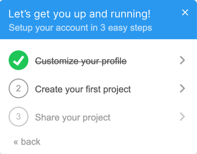
An onboarding checklist shows the two or three steps that end in a first win, and tracks progress against them. Its real job is psychological: it turns an unfamiliar product into a short list with a visible finish line, which is a much easier thing to start.
A walkthrough or product tour carries someone through one task the first time it matters. Tours have a reputation problem, and a fair amount of it is earned, so they're worth understanding properly before you build one. We've covered when a product tour is the wrong tool in its own guide, including what the usability research says.
Hotspots and tooltips answer a question at the place the question occurs. A beacon next to a control the user is about to need beats a paragraph in a help center they'd have to go looking for.
Empty states are the screens that exist before there's any data, and they're the most commonly wasted surface in software. A dashboard with nothing on it and no instruction is a dead end, where the same screen with one clear action is an invitation. Nielsen Norman Group's guidelines on designing empty states make the same case, noting they can communicate system status, help people discover features they haven't used, and provide direct pathways for getting started with key tasks.
For the tactical version of this list, with worked examples from products you'll recognize, our five things the teams that get it right do differently goes further into each one.
Which mechanism fixes which problem?
Match the mechanism to the failure you can actually observe, rather than building the whole set because a competitor has it. Most onboarding work that goes nowhere goes nowhere because it was chosen from a list of features rather than from a symptom.
| What you're seeing | What's usually causing it | What to reach for | How you'll know it worked |
|---|---|---|---|
| Users sign up and never come back | They never reached anything worth returning for | A checklist naming the two or three steps to a first result | Share of new users completing the checklist, and reaching the result |
| Setup finishes, then nothing happens | The first screen after setup doesn't say what to do | An empty state with exactly one action on it | Share of users taking that action in the first session |
| A feature nobody uses | Users don't know it exists, or when it's relevant | A hotspot at the moment it becomes relevant, not at signup | Adoption of that feature among users who saw the prompt |
| Everyone drops at the same step | That step asks too much, or isn't clear | A short walkthrough targeted at that step only | Drop-off at that step, before against after |
| Support answers the same question weekly | The answer isn't where the question comes up | A contextual hint at that exact place | Volume of that ticket type |
The pattern is that guidance works when it's tied to a moment. Something shown at the point of confusion gets read, and the same content shown as a wall of introduction on day one does not. That holds after the first week too, which is why feature announcements land better on the feature itself than in an email a user was never going to open. That's also the argument for building this without engineering time: if a change takes a sprint, you'll make three of them a year, and onboarding gets good through revision rather than through being right first time. Tools like HelpHero let you build checklists and hotspots and target them by user property, device or language, which is what makes a weekly change realistic rather than a quarterly one.
How do you measure SaaS onboarding?
Four numbers cover it: activation rate, time to value, feature adoption rate and step drop-off. Each one is useful and each one hides something, so it's worth knowing what you're not seeing.
Activation rate is the share of new users who complete your activation event within a set window, usually a week. The entire number depends on how honestly you define that event, and a weak definition flatters you enormously. If your activation event is "created an account" then your activation rate is 100% and it means nothing. Pick the action that genuinely predicts someone sticking around.
Time to value is the median time from signup to that same event. Medians are the right default here, because averages get wrecked by the handful of accounts that take three months. The thing a median hides is a split population: if half your users activate in ten minutes and half take two weeks, the median describes neither group, and you'd learn more from looking at the two separately.
Feature adoption rate is the share of users who use a given feature, out of the users who could reasonably use it. The denominator is where this goes wrong. Measuring adoption of an admin-only feature across your whole user base tells you almost nothing, and will make a healthy feature look dead.
Step drop-off is the share of users who leave at each step of a flow. It's the most directly actionable of the four, because it points at a specific screen. What it can't tell you is why, and the temptation is to assume the step is confusing when sometimes it's asking for something people don't have to hand.
Worth knowing where these actually come from, because it's rarely one place. The first three are product analytics questions, since they need to know what a user did across your whole application, while step drop-off comes from whatever built the flow. If your onboarding tool can push its own events into your analytics, the join between the two is where the useful analysis lives: not just how many people finished the checklist, but how many of those went on to reach the thing you were pointing them at.
If you want to go further into the math, particularly the denominator problem, how to calculate an adoption rate honestly covers it in detail.
What goes wrong most often?
The most common failure is building a tour of the interface rather than a path to a result. It's an easy mistake to make, because a walkthrough of your navigation is a natural thing to write and it feels like being helpful. From the user's side it's a list of things they didn't ask about, standing between them and the thing they did.
The second most common is front-loading. Everything gets shown before the user has done anything, which is exactly when they have the least reason to pay attention and the least context to attach it to. Nielsen Norman Group's research on onboarding tutorials found that they slow users down, get in the way, and don't result in better task performance. That's really a finding about timing rather than about any one mechanism, because the same content lands differently when it arrives at the moment somebody needs it. Our product tours guide covers what it means for tours in particular.
Length is the last one, and it's less about a number of steps than about whether each step earns its place. A four step flow where two steps are throat clearing is worse than a six step flow where all six move you forward.
How do you decide what to build first?
Start where people are already leaving, rather than where you think the experience is weakest. Those are different places more often than you'd expect, and the data settles it faster than a discussion will.
- Find the step with the largest drop-off. Look at where users leave in their first session. If you can't see that yet, that's the first thing to fix, because everything below depends on it.
- Write down what you want them to do instead. One sentence, naming a specific action. If you can't write it, the problem isn't onboarding and more guidance won't help.
- Build one piece of guidance at that step, and resist making it two. The temptation to fix five things at once is what makes the result unreadable afterwards.
- Wait for a full cohort before you judge it. Compare the users who saw it against the ones who came through the week before, rather than comparing to your overall average.
- Keep it only if the number moved. If it didn't, take it out. Guidance that doesn't help is still costing attention.
That loop is smaller than most onboarding projects, and that's the point. Each pass takes a week or two and tells you something true, where a full redesign takes a quarter and leaves you unable to say which part of it worked.
Onboarding is a system you revise, not a project you finish
The thread running through all of this is that onboarding is less a thing you build than a thing you keep pointed at the truth. The product changes, the users change, and a flow that was right in March is quietly wrong by September without anybody touching it.
So the practical version is unglamorous. Define the result you want a new user to reach, put the smallest useful piece of guidance at the place they're currently falling short of it, measure that one change against a real cohort, and then do it again. Four numbers tell you whether it's working, one table tells you which mechanism to reach for, and the boundary at the top of this article tells you whether it's your problem to solve at all.
If you want to run that loop on your own product, HelpHero has a free trial and installs like any other script tag, so you can put a checklist in front of real users this week and see whether the number moves.
Common questions about SaaS onboarding
How do you deliver good SaaS onboarding?
Pick one result that a new user should reach, then remove or defer everything between signup and that result. After that, put guidance only at the points where users currently fall short: a checklist if the first screen is blank, a hotspot if a feature goes undiscovered, a short walkthrough if one step loses people. Measure each change against the cohort before it, and keep only what moves the number. Good SaaS onboarding is mostly subtraction, with a small amount of well-placed direction.
What are the 5 pillars of onboarding?
That framing comes from HR and employee onboarding rather than from software, and you'll find several different lists published under the name. It's a useful reminder of how often the two get mixed up. For in-app onboarding the equivalent isn't a list of pillars at all: it's a single question about whether a new user reached a real result, and a short list of mechanisms you can put in their way to help. If a result you can name and observe is missing, no framework will substitute for it.
How long should SaaS onboarding take?
Short enough to reach a first result in one sitting, which for most products means minutes rather than an afternoon. You'll see specific numbers quoted around this, and they're rarely sourced, so treat them as somebody's rule of thumb rather than a benchmark. The better test isn't length at all: it's whether every step moves the user toward the result, because a short flow padded with introductions is worse than a slightly longer one where nothing is wasted.
What's the difference between SaaS onboarding and customer implementation?
SaaS onboarding happens inside the product and usually runs without anyone from your team present. Implementation is a project your team runs with a named customer, often involving kickoff calls, data migration, configuration and training against a go-live date. They have different owners, different tools and different measures of success. Many companies need both, and the mistake is trying to fix one with the other: in-app guidance won't rescue a stalled enterprise rollout, and a kickoff call will never reach a self-serve signup.
Do you need a tool to build onboarding?
You can build guidance straight into your application, and plenty of teams do. What a no-code tool changes is who gets to do the work. The people who can see why a new user is stuck, meaning product, customer success and support, build the checklist or tour themselves and change it the same day, without filing a ticket or waiting for a release. Your developers get that time back for the product. Since onboarding only gets good through revision, being able to change it weekly matters more than any single feature.
How do you know if your onboarding is working?
Track activation rate and time to value for the overall picture, and step drop-off to find the specific place to work on next. Compare cohorts rather than looking at a running average, because an average will blur the change you just made into eighteen months of history. One caution worth repeating: your activation rate is only as meaningful as the event behind it, so if the number looks unexpectedly healthy, check what you're counting before you celebrate.