Product Tours: What They Are and When They Actually Work
A product tour walks a new user through your app in a few guided steps. Here's how they work, what the usability research says about them, and when a tour is the wrong tool for the job.
 Jennifer Tee11 min read
On this page
- What is a product tour?
- How does a product tour actually work?
- What does the research actually say about product tours?
- Why do people skip product tours?
- What separates a tour worth building from one people skip?
- What does a well-timed tour look like in practice?
- How do you build a product tour without engineering time?
- Where product tours earn their place
- Common questions about product tours
A product tour is a short sequence of guided steps that runs inside your web app and walks a new user through the parts that matter. Each step points at something real on the screen, explains what it does, and moves the person along. Teams reach for tours because they get someone to a first useful outcome without a support call or a hunt through the docs.
That's the definition, though the more useful question is what separates the tours people finish from the ones they dismiss in the first two seconds. The usability research is unusually specific on that point, and it should change what you build.
What is a product tour?
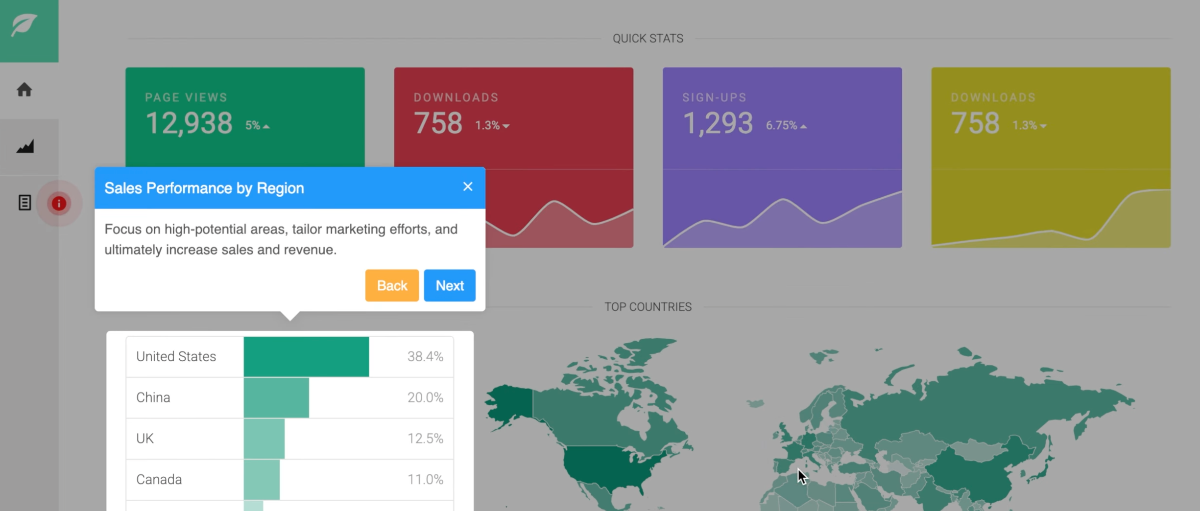
A product tour is guidance that runs inside the product itself, layered over your real interface rather than sitting in a help center. A step highlights an element on the page, adds a short explanation, and offers a way forward. String a few of those together and you've got a tour.
The word gets stretched to cover three different things, and the distinction matters, because it changes what you build and how you measure it.
A product tour orients someone to the product as a whole. It answers "what is this and where am I", usually on a first session, and its success measure is whether someone understands the shape of the product well enough to start.
A product walkthrough drives a single task to completion. It answers "how do I do this specific thing", it's usually triggered by the person trying to do that thing, and its measure is task completion.
A product demo is a sales asset. It runs before signup, often on a marketing site, and its measure is whether someone books a call or starts a trial. It's a different audience at a different moment, and building one when you needed a tour is a common and expensive mistake.
If you take one thing from the vocabulary: a tour is for orientation, and orientation is a much smaller job than most tours try to do.
How does a product tour actually work?
Mechanically, a tour is a sequence of steps attached to elements in your interface, plus rules about who sees it and when.
Each step needs an anchor, which is the element on the page it points at. That anchor is what makes in-app guidance different from a video or a help article: the instruction sits next to the thing it describes, so nobody has to translate between a screenshot and their own screen. Steps carry a short piece of copy, and usually a button to advance, skip or finish.
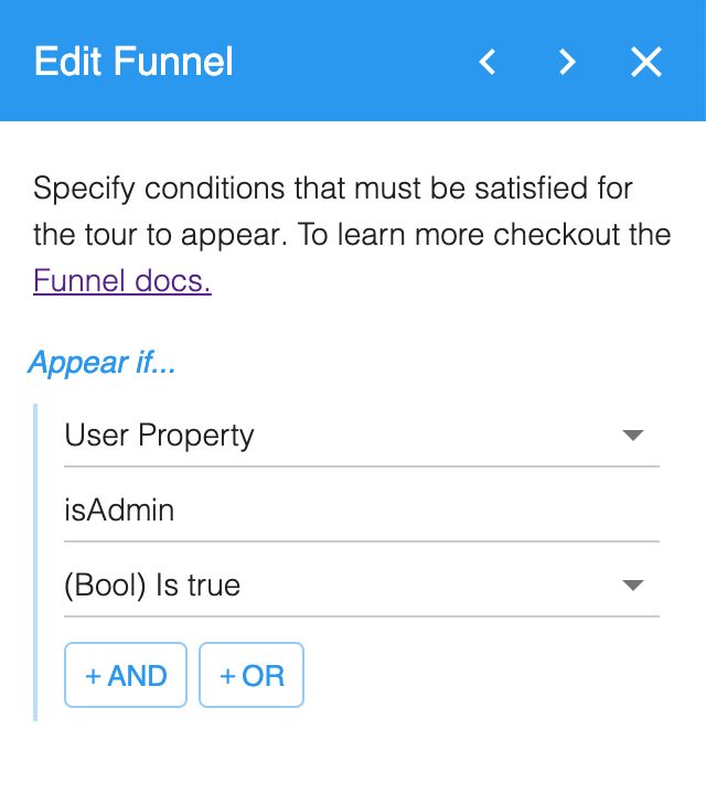
The second half is targeting, and it's the half teams underuse. A tour that fires for everyone who logs in is a blunt instrument. Useful targeting decides who sees a tour based on what you already know about them: whether they're new or returning, what their user properties say about their role, which page they're on, what device they're using, or whether they've already done the thing the tour is about.
The third piece is measurement, and it's the one teams skip. A tour nobody finishes is worse than no tour, because it spends your users' attention and gives you nothing back. Step level completion tells you where people leave, and that's usually a more honest signal about your interface than about your copy.
There's one last thing worth knowing about how tours start, because most teams assume they only run for people who are already logged in. Autostarting on a trigger is the usual way, but you can also just send someone a link. It's one of your own URLs with the tour's ID on the end, so a tour can go in an email, in your documentation, or in a reply to a support question. That makes it something you hand over when someone asks, rather than something that fires at them unasked.
And they don't have to be signed in. Showing tours only to signed in users is the normal setup and what most teams want, but HelpHero has an anonymous mode for when it isn't. A tour can run for a visitor who doesn't have an account yet, and if they sign up later that record upgrades to an identified one, so what they've already seen comes with them.
What does the research actually say about product tours?
Less about tours than about timing, which turns out to be the more useful answer. The best public evidence here doesn't come from a vendor, and it's worth reading carefully before someone quotes the headline at you.
Nielsen Norman Group ran a between-subject usability study on four iOS apps with 70 participants, splitting them into people who read the app's tutorial and people who skipped it. They measured perceived ease of use with the Single Ease Question, a one to seven scale.
Every participant who saw a tutorial saw the same one, shown upfront, with no targeting of any kind. Under those conditions the group that skipped it rated the apps easier to use.
The gap looks small, and it was statistically significant at p equals 0.047. Task success pointed the same way, at 94 percent for skippers against 91 percent for readers. So did the time people took to finish, though that difference wasn't significant.
5.49 vs 4.92
Perceived ease of use for people who skipped the tutorial against those who read it. Reading the tutorial made the same app feel harder.
Read the conditions before reading the result. The study covered four relatively simple iOS apps, where the interface was largely self-explanatory and the tutorial arrived before anyone had a question. Nielsen Norman Group's own guidance elsewhere notes that walkthrough tutorials did show value for onboarding people to unfamiliar interaction paradigms, which is the opposite case. So the finding isn't that guidance fails. It's that untargeted guidance, delivered before someone has a reason to want it, often costs more than it returns.
Their recommendation is specific rather than sweeping: think twice about a tutorial for a simple application, because that effort is better spent making the interface easy to use. For software people genuinely have to learn, the question becomes when the guidance arrives and who sees it.
Why do people skip product tours?
Almost always because it arrived before they had a reason to care.
Nielsen Norman Group draws the distinction as push versus pull. A push revelation arrives whether or not you wanted it, which is what an autostarting tour on first login is. A pull revelation is help you get because something signalled you needed it right then. Their position is that contextual help usually works better, for three reasons that will sound familiar to anyone who's watched a session recording.
People want to start using the product, not read about it. Guidance delivered upfront is hard to recall at the moment it becomes relevant, which can be days later. And dismissing an unwanted overlay costs effort, which sours the first thirty seconds of the relationship.
Pull: help when it's wanted
A hint appears next to a feature the first time someone opens the screen that uses it. A checklist sits in the corner and waits. A walkthrough starts because the person clicked "how do I do this".
Push: help before it's wanted
A seven step tour autostarts on first login and covers the whole interface. It arrives before anyone has a question, and it has to be dismissed before any real work can start.
None of that argues against building tours. It argues for deciding when each one fires, which is a targeting problem rather than a content problem, and it's the part most teams skip. If you only change one thing after reading this, change that.
What separates a tour worth building from one people skip?
Four things, in rough order of how much they matter.
Timing. A tour that starts when someone has a reason to want it will beat the same tour delivered on login. Tie yours to a moment: they reach a page for the first time, they create a first item, they hit a feature they haven't used.
Length. Every extra step is another chance for someone to leave. Orientation rarely needs more than a handful of steps, and if yours needs more, the honest fix is usually to split it by task rather than to keep going.
Relevance. A tour shown to everyone is written for nobody. Target it by role, or by what someone has already done, and you turn generic guidance into something worth reading. It's the single most underused capability in this category.
An exit. Skipping has to be obvious and cheap. The research is consistent that forcing people through guidance costs you more than it returns, and a tour nobody can escape is one your users will resent.
For the broader picture of where guidance sits alongside the rest of a first session, our five tips for SaaS user onboarding covers the parts a tour can't do on its own.
What does a well-timed tour look like in practice?
Three shapes cover most of what you're likely to need, and they differ mainly in what triggers them.
The first-session orientation is the one people picture when they hear "product tour". It runs once, covers the two or three places someone needs to know about, and stops. Its job is to make your interface legible enough that exploring feels safe, rather than to explain every feature. Keep it to a handful of steps and you'll get the version people finish rather than the version they dismiss.
The feature introduction is narrower and usually more valuable. Something has changed, or someone has reached a part of the product they haven't used, and a short piece of guidance explains it at that moment. Because it fires on a signal rather than on login, it reaches someone who already has a reason to read it.
The on-demand walkthrough waits to be asked. It sits behind a hint or a checklist item and starts when someone chooses it, which makes it the closest thing to the contextual help the research favors. Nielsen Norman Group's guidance for this kind of help is worth following closely: make it easy to dismiss and to recall later, reveal detail progressively rather than all at once, and don't ask anyone to memorise something they'll need days from now.
Most products end up wanting all three, and the mistake is building the first one at the length of all three combined. A short orientation plus a few well-triggered introductions will do more for you than one long tour trying to carry the whole product on a first session.
How do you build a product tour without engineering time?
The reason this category exists is that tours built by hand become somebody's maintenance job. Every step is tied to an element in your interface, so a redesign quietly breaks a flow nobody's looking at.
Dedicated tooling moves that work out of the codebase. HelpHero is a no-code tool for building product tours, checklists and hotspots: you add one JavaScript snippet to your web app, then build guidance in a point-and-click editor, with a Chrome extension for building against your own site. A step can point at a real element, carry formatted text, images or video, and inject a user's own properties into the copy so the guidance reads as though it was written for them.
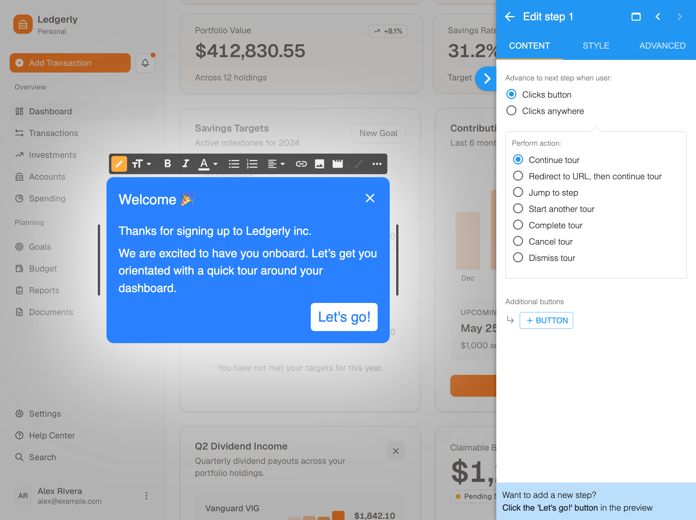
Targeting is handled by funnels, which decide who sees a tour by user property, user event, URL match, device type, whether the person is new or returning, or on a schedule. You can split test two versions against each other. Analytics report completion and step level drop-off, so the question of which step loses people is answerable rather than a matter of opinion.
Two honest limits are worth naming. HelpHero builds guidance for web apps, so a native mobile app is outside what it does. And it reports on your tours rather than on your whole product, so you'll still want your own analytics tool for anything wider than guidance performance.
Where product tours earn their place
The evidence points somewhere more specific than either side of this argument usually allows. A tour is a strong answer to a narrow question: someone has arrived, they don't yet know the shape of the product, and a few well-timed steps will get them to something useful faster than wandering would. If your software is something people genuinely have to learn, that's worth real money in support tickets you never receive.
What the research rules out is the lazy version. Shown to everyone, before anyone asked, covering the whole interface, with no way out. That pattern tested badly on simple apps and it'll test badly on yours, and it's also the version that takes the least thought to build.
So build the short, targeted, escapable one. Measure it against the outcome it was meant to cause rather than against its own completion rate. Then spend the time you saved on the part of the interface that made the tour feel necessary.
Want to see what that looks like in your own app? Pricing starts with a free trial, and you can build your first tour in an afternoon.
Common questions about product tours
What is a product tour in software?
A product tour is a sequence of guided steps that runs inside a web application and introduces a new user to its main areas. Each step points at a real element on the screen and explains it, so the instruction sits next to the thing it describes rather than in a separate help article. Tours are typically shown during a first session, and their job is orientation rather than task completion.
What is the difference between a product tour and a walkthrough?
A product tour orients someone to a product as a whole and answers "what is this and where am I". A walkthrough drives a single task to completion and answers "how do I do this specific thing". Tours usually run on a first session and are measured on whether people understand the product's shape. Walkthroughs are usually triggered by someone attempting the task, and are measured on whether they finish it.
Do product tours actually improve activation?
They can, and the conditions matter more than the format. A Nielsen Norman Group study of four simple iOS apps found that an untargeted tutorial, shown to everyone before they had a question, made those apps feel harder to use rather than easier. Guidance tends to earn its keep when it arrives at the moment someone needs it and is aimed at the people it applies to, which is a targeting decision rather than a content one.
How many steps should a product tour have?
Fewer than most teams end up building. Every additional step is another opportunity for someone to leave, and orientation rarely needs many. If your tour keeps growing, the usual fix is to split it into shorter task-specific guidance triggered when each task comes up, rather than to extend a single first-session sequence.
When should you not use a product tour?
When the person has no reason to care yet, and when the interface itself is the problem. Help delivered before someone has formed a question tends to be dismissed and forgotten, so contextual hints triggered by what the person is doing usually work better. And if your product genuinely can't be understood without a tour, the guidance is compensating for the interface rather than improving it.