Feature Discovery in SaaS: What to Show, and How Often
What feature discovery means inside a SaaS product, when to reach for a checklist, a tour or a hotspot, how often you can interrupt before users stop reading any of it, and the two numbers that tell you what to fix.
 Jonas Budelmann9 min read
On this page
Somewhere in your product there's a feature that solves a real problem for a real customer, and they have no idea it's there. That's feature discovery, or the lack of it: getting users to notice what your product can do at a moment when it's worth their attention. It's the step before adoption, because nobody builds a habit around a feature they've never seen. In a web app that happens inside the running product: checklists, short tours, hotspots sitting on the feature itself, and the empty screens users hit before they've set anything up.
How much of your product a user actually finds decides a lot about how fast they reach something worth paying for. One quick note first, because two other fields use the same phrase. In Kubernetes it means detecting the hardware on a node, and in machine learning it means finding variables for a model. This is about neither of those. It's about the features in your own product and the users who never find them.
What is feature discovery?
Feature discovery is the point where a user notices a capability exists and works out when it's useful to them. Noticing it is only half the job, and the other half is working out when it would actually help. A user who has looked at a button labeled "Automations" for six months without clicking it hasn't discovered anything. They've learned to ignore a word on the screen.
Keep discovery and adoption apart in your head, because a low number on each one has a different cause and a different fix. Say you shipped a bulk edit last spring. If nobody has opened it, that's discovery, and a hotspot on the right screen might fix it. If two hundred users tried it once and never came back, that's adoption, and pointing at the button again won't change their minds. Either the bulk edit doesn't save enough time to be worth the trip, or it isn't the job they came to do.
That one distinction can save you months of wasted work. Teams reach for in-app guidance whenever usage looks flat, and often their users had already found it and decided against it.
Most of what you ship never gets found
You probably suspect as much already. Pendo's 2019 Feature Adoption Report found that "80 percent of features in the average software product are rarely or never used", with an average of 12% of features generating 80% of daily usage. That came from anonymized usage across 615 Pendo subscriptions over three months.
Before you put that on a slide, read the small print. It's from 2019, it describes one vendor's customer base, and it gets quoted with none of that attached. The finding that survives is simple. A handful of features carry your product, and the tail behind them is longer than any roadmap admits. Some of that tail is stuff nobody wanted. The interesting part is the slice your users would love if they knew it was there.
Why do users miss features they'd actually want?
Because they're busy doing something else. A user comes to your product with a job in mind, and everything that isn't that job is noise they've trained themselves to skip. Nielsen Norman Group has the eyetracking to prove it. Their 2018 banner blindness studies found that people ignore anything sitting where ads sit or looking like an ad. Worse, once an ad turned up in one spot, they avoided that whole region on later pages. In one study attention to the right rail was "33 times smaller than its size might have warranted".
Your in-app prompts inherit that reflex. A floating card with a colored background and a little dismiss cross is, visually, an ad, and it gets closed by exactly the users who wanted what it said. What works is moving the message to where the work is happening, pinned to the thing it describes.
You can also just be early. A prompt about scheduled reports means nothing in a user's first hour, and quite a lot six weeks later when they're rebuilding the same view every Monday. Show it too soon and you get nothing, except a user who has learned your prompts aren't worth reading. Some features also carry a setup cost no prompt can remove. If yours needs an integration connected before it does anything, you'll lose users who understood it perfectly well and didn't have a spare hour that afternoon.
Match the pattern to the moment
Choose by where your user already is, not by the pattern you enjoy building. Five moments cover almost all of it.
| The moment | What fits | What it costs you |
|---|---|---|
| First session, nothing set up yet | A checklist of the first few tasks | Sits on the screen for days, so it has to be short |
| A feature that only makes sense mid-task | A hotspot on the element itself | Easy to miss if the dot is too faint |
| Something a user has to be walked through | A short guided tour | Interrupts properly, so it needs a real reason |
| A feature you shipped after users learned the product | A hotspot placed on the new button | Invisible to users who don't visit that screen |
| A screen that stays empty until a user acts | The empty state itself | Only reaches users who already got there |
The split between the middle two rows isn't a matter of taste. Material Design draws the same line: a tap target or hint text for anything a user can finish in one action, a guided flow only where the feature genuinely takes several steps. Put a five-step tour on a one-click feature and you've spent a prompt teaching a user to press a button.
The empty state is the one everybody underuses. It's the only place where a user is stuck and looking at the screen, and it interrupts nothing. An empty reports screen explaining what a report is for beats any prompt fired at the same user a week later.
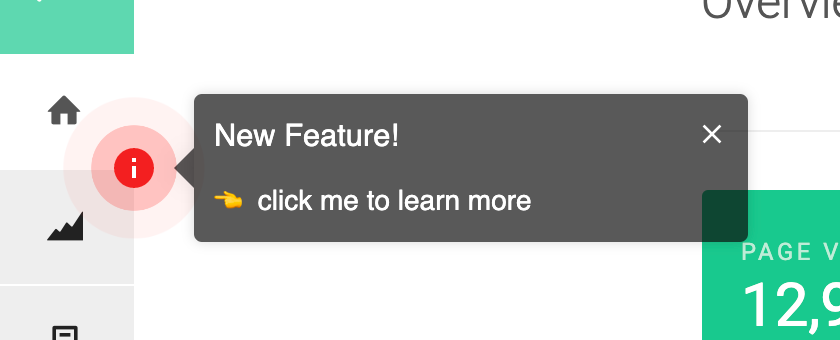
For the contextual cases, a hotspot sitting on the feature is usually the smallest thing that works. A hotspot is the small dot pinned next to a button, and in HelpHero it opens on click or hover. A condition can make it show only until a user has opened it once, and a dismiss button means it never comes back for that person. You can point the same hotspot at different users by properties, events, device type or URL, which keeps a two-day-old account and a two-year customer from seeing the same prompt. Announcements work the same way, as a hotspot on the new feature rather than a message pushed at everybody, and announcing a new feature in the product covers it.
How often can you interrupt?
Once a session, if you want a number to hold yourself to. Think of it as a budget: one interruption per visit, and everything you want to say competes for it. The number comes from Material Design's own feature discovery guidance, which says to "limit the number of feature discovery messages you present in your UI. For example, don't display more than one per session." The same page tells you not to prompt the moment a user opens the product, since they opened it to do something specific. Save your prompts for "moments when they will help the user better complete the action they're taking".
Treat a dismissal as information, because that's what it is. Material's rule is that once a user closes a message, you don't show it or anything like it again "for a more substantial period of time". A user who accepts one has earned you the right to show related messages sooner. That asymmetry is what turns a pile of prompts into something that behaves like a system. Without it every prompt is a fresh coin flip, and your users learn to close things on reflex.
The wording decides whether that interruption was worth spending. Atlassian's design system puts it about as plainly as it can be put in its own feature discovery guidance: titles and messages "should clearly indicate user benefits. For example, 'Find your work faster' instead of 'New search'." Write the benefit into the title and the interruption pays for itself.
The two numbers that tell you what to fix
Track two numbers per feature and they'll tell you which problem you've got. Discovery rate is the share of users who could use the feature, meaning they're on the right plan with the right permissions, and reached it at least once inside a window. Thirty days is a fine default. Adoption is what happens next: of the users who got there, how many came back. Both are the per-feature version of the activation rate you watch for signups.
Put them together and you get four answers. Low discovery with high adoption is the nicest problem to have: the users who find it love it, so all you have to do is point at it. High discovery with low adoption means the pointing works and the feature doesn't. Stop adding prompts and go talk to the users who bounced. Low on both and you have a feature nobody asked for, worth knowing before you spend a quarter promoting it. High on both, leave it alone and go find the next one.
Benchmarks here are thin, and the one everybody quotes needs reading twice. Pendo publishes a "feature adoption rate" with a median of 6.4%, rising to 15.6% for products in the top 10%. That is not the share of users who adopt a feature, which is how you'll see it repeated. It counts how much of a product's feature set generates 80% of click volume. So 6.4% means about six features in every hundred you ship carry most of the clicking.
Even the best products run on about a sixth of what they built. The good news is you don't need new tracking for either number. If you already count which features carry your usage, discovery is the same data asked a different question: how many users got there once, not how often they return.
Start with the feature you'd hate to lose
Pick the feature you'd genuinely hate to lose, then look up how many of the users who could use it have ever opened it. That takes ten minutes, and the answer decides everything after it. If almost nobody has been there, you have a visibility problem, and the fix is a checklist, a hotspot or a tour, depending on the moment. If plenty arrived and left, you have a product conversation, and it's better to have it honestly than to keep stacking prompts on top.
Either way, hold the line on that budget while you fix it, because it's the only reason your next prompt gets read. One hotspot on a screen a user already visits does more than three cards elbowing each other in the corner. If you want to see that without waiting on engineering, you can watch one get placed on a live screen.
Common questions about feature discovery
What is feature discovery?
Feature discovery is the process of getting users to notice a product capability and understand when it's useful to them. In a SaaS web app that means in-app guidance: a checklist in the first session, a hotspot on the feature, a tour where it genuinely takes several steps, and the empty state a user meets before setting anything up. It's separate from feature adoption, which is whether they keep using it afterward.
What's the difference between feature discovery and feature adoption?
Discovery is the first time a user reaches a feature. Adoption is whether they come back to it. The distinction matters because the two fail for different reasons. Low discovery means users never saw it, which in-app guidance can fix. Low adoption after high discovery means they saw it and passed, which is usually telling you something about the feature itself. Measuring only one of them hides which problem you actually have.
How do you measure feature discovery?
Count the share of users who could use the feature, meaning the right plan and the right permissions, and reached it at least once inside a fixed window. Thirty days is a reasonable default. Then track how many of those users came back to it. The first number is discovery and the second is adoption. Compare them for one feature at a time, since a product-wide average tells you nothing about where to point your next prompt.
How often should you show in-app prompts?
Material Design's guidance is a practical ceiling: no more than one feature discovery message per session, not at the moment a user opens the product, and timed to help with the action they're already taking. Treat a dismissal as a longer pause on that message and anything like it, and treat an acceptance as permission to show a related one sooner.
What's the best way to tell existing users about a new feature?
Put the prompt on the feature instead of in front of it. A hotspot sitting on the new button reaches users at the moment they're on that screen and looking at that part of the product. Set a condition and it stops showing once they've opened it, and a dismiss button retires it for good. Target it to the segment the feature is actually for, and lead with what it does for them rather than with its name.